One of the biggest problems when web technologies started to become widespread was that they could not keep up with the new technology of the day, tablets and smartphones. Web developers had to write separate html files for each device. Nowadays, we hear the concepts of responsive or responsive design. With these concepts, it is no longer difficult to make web templates compatible with all devices.
What is Responsive?
The general translation of responsive in Turkish is “compatible”. Web developers want to develop projects compatible with every device.
What is Responsive Design?
Responsive in Turkish means design compatible with every device. When you want to buy a web template, you can understand that if you see the phrase 100% responsive design in its features, you can understand that that template can work harmoniously for every device.
Advantages of Responsive Design
- No need to create separate html files for each device.
- Ease of management in css.
- Seo provides a great advantage.
- Less coding faster website.
Css Codes Used for Responsive Design
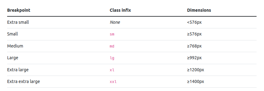
Responsive design has entered the web world with the @media css tag. Let’s examine it with an example. The breakpoint codes below belong to the bootstrap 5 css library.
// Small devices (landscape phones, 576px and up)
@media (min-width: 576px) { ... }

// Medium devices (tablets, 768px and up)
@media (min-width: 768px) { ... }

// Large devices (desktops, 992px and up)
@media (min-width: 992px) { ... }

// X-Large devices (large desktops, 1200px and up)
@media (min-width: 1200px) { ... }

// XX-Large devices (larger desktops, 1400px and up)
@media (min-width: 1400px) { ... }
With the @media breakpoints above, you can make responsive designs by adding css codes according to the minimum screen width.
In this blog post, I have given you information about responsive and responsive design concepts, take care of yourself to see you in my next blog post…


